The good news is that the piece survived being wrapped around an 11” diameter drum scanner. The gold looks no worse for wear and I am almost breathing again. The less than good news is that gold leaf doesn’t scan worth a damn. I’m not laying this on the fabulous folks who did the scan, they did the best they could, and if it wasn’t for the gold, the scan would be perfect. This is going to lead me on my next big adventure in art prints; how do you reproduce gold in an archival print?
Meanwhile, back at the drawing board…
 My original concept had the bees in a more abstracted form. But when the colors in the spiral started doing cool things, I knew the bees had to be more realistic, thereby adding depth. They are not completely realistic, they still fit within the confines of a circle, but there was a lot of – draw a few lines – look at a photograph – draw a few lines – look at a photograph. The painting process wasn’t much faster.

The bees are mostly done (I went back later and punched up the black) and I’m laying down the first layer of black, which isn’t really black.
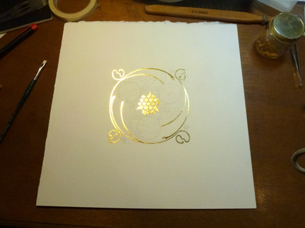
With the bees finished, I moved on to the ‘black’. I write it that way because it isn’t black. In fact there isn’t any black on this piece at all. What you see here is a mix of Burnt Umber and Ultramarine. If any of you have studied classical painting, you will have heard of this mixture. I had not until recently. My usual mix for black is Alizarin Crimson, Prussian Green, and Indigo. I think these pigments have seen changes that offer better lightfastness and lower toxicity, and I think there has been a color shift as well. My old black mix doesn’t respond the way it used to. It’s a subtle thing that most people would not notice. I do. So I went to the Ultramarine/Burnt Umber mix and got very nice results. There was a slight panic when I realized I had no Burnt Umber paint. Luckily I remembered my natural pigments and ground up a small batch. It blended beautifully with the Ultramarine. The snippet you see above is just the first layer. I went back with two or three more layers to get the density I wanted without that flat wash look.

The final. Whew!
I am very pleased with the finished piece. I’ve been calling it the bee spiral, but the real name is ‘The Waggle Dance’, and the gold pattern in the corners is derived from the motions the bees go through. Honey bees use this ‘dance’, and others, to communicate the location of a nectar source when they return to the hive. It is thought that some insecticides may inhibit the bee’s ability to waggle dance, thus making it harder to find food, which in turn, could be a contributor to colony collapse disorder. For this reason, I’m going to dedicate at least 10% of sales to research and preservation for honey bees.