A Novel Diet #5 and Art!

There’s been a bit of editing since the last post, as well as other commitments taking me away from the keyboard. I did notice, however, that editing doesn’t hold the same creative drive that writing does, even if the editing requires sizable chunks of rewriting. To scratch the creative itch, as it were, I decided to work on a drawing of my main character. It also didn’t hurt that I could use an extra piece for our local SCBWI chapter sample show. (About a dozen of us brought in postcards, tearsheets, and other printed samples for display before and after the meeting.)

I’ve been fussing around with doing black and white illustration using black Prismacolor pencils, with perhaps a black watercolor wash underneath. I love the technique but for one thing. It is so blasted slow. Layers upon layers of shading looks lovely, but takes forever, and then is very picky about scanning and reproduction. So I thought, ‘why not go back to pen and ink? That’s fast. Right?’


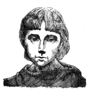
JeanRough72

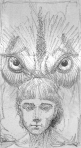
The original sketch, about 1.5″ x 2.5″

I started with a small drawing of my hero out of my sketch book, scanned it, then blew it up to match the size of the original sketch of the wolf.

Wolf&JeanRough72

Resized and layered in Photoshop.

I blew them up again so the image was about 5”x8”, then printed it out and reworked it with black Prismacolor, correcting anatomy and shading. On a piece of tracing paper I did a rough ink, basically to see where to stop drawing.

Done on cheap tracing paper with a crowquill nib.

Done on cheap tracing paper with a crowquill nib.

The wolf was inked on a separate piece of tracing paper. I think the first piece was too small.

The wolf was inked on a separate piece of tracing paper. I think the first piece was too small.

Once I was reasonably confident, I put the reworked printout on my light table with a piece of Arches 90# hotpress on top, and went to town.

Overall, I like the way it turned out. The difficulty has proven to be in trying to repeat this success. I have tried twice, with another character, and neither one works as far as I’m concerned. It may simply be a matter of refining my technique, or accepting that I’m using the wrong technique. Either way, it’s worth the effort.


Jean&Wolf72

The final on Arches 90# hotpress watercolor paper. Crowquill with Calli black calligraphy ink.

As I mentioned at the top of this post, I did do some editing. I’m maybe a quarter or a third of the way through the manuscript, and my critique group just gave me some wonderful feedback which might actually make the book shorter. Here’s hoping.

128,999 words

Let’s Put On a Show!

SCBWI_illustratorShowPoster

The Western Washington chapter of the SCBWI has a wealth of amazing illustrators. But you don’t have to take my word for it. You can see for yourself at the Washington State Convention Center. The show went up on October 10th and one of my pieces (this one) is included. Please go see it if you have the chance.

And speaking of shows, I had seven pieces at the Avanti gallery during the month of September, and one of them (this one) sold before the show even opened!

Thanks to everyone that put these two shows together and to everyone reading and liking this blog. It doesn’t matter if you are in Seattle or halfway around the world. Go Out. See Art. Be Enriched.

Painting Outside the Lines

FoxgloveWeb

This is a foxglove growing next to my studio. It is not what one normally thinks of when one thinks of foxglove. That tall, spiky flower to the left is what we expect, not this strange frilly cup. I assume what we’re looking at is a mutation. (Any botanists reading this feel free to step in with an informed opinion.) But it really seems to me as if nature is painting outside the lines.

As a representational artist, this concept brings about an involuntary twitch. However, if I stop and think about it, (breathe, calm down, it’s just a flower) it’s kind of inspiring. After all, if Mother Nature can do the unexpected, why can’t I?

In a workshop with the wonderful Dan Santat, he lamented the fact that so many artists paint the sky blue (mea culpa). He suggested orange, or purple, or green, if that’s what the painting needs. The minor disclaimer here is that he was specifically referring to children’s illustration, but I think the concept can apply elsewhere.

I recently read ‘Grave Mercy‘ by Robin LaFevers. About a quarter of the way through, I almost stopped reading. It felt like a very predictable plot-line unfolding. The friend who recommended the book said, “Just keep reading”. I’m glad I did. Everything I expected to happen, did happen. Just not in the way I expected it to. Ms. LaFevers was painting outside the lines.

I’m currently working on some art that is interesting in the concept stage, but it’s not right yet. That’s because I haven’t taken it far enough. I’m still too close to what one would expect.

For some of us, it’s a difficult thing to do – paint the sky green, write a likable villain. But it’s where our best work can come from. How do you take things beyond expectations? Do you exceed pre-defined borders in your art? Tell me why. Send me links.

Let’s enjoy the view from the edge of too far.

A Thank You

Over the weekend of April 19-21 I attended the SCBWI Western Washington regional conference in Redmond. I could talk about all the fun stuff I did and the cool things I learned, but there was something different this year. For the first time since I started going to these conferences (six years?) I put my portfolio on display.  My excuse (whether valid or not) was that I didn’t have enough pieces worth showing. But at the 2011 conference, I got hooked up with an illustration critique group and it’s safe to say that if I hadn’t, my portfolio would not have been there.

So as a thank-you to these wonderful folks, they get the spotlight today. Their websites/blogs are listed in the side bar. Please check out their work.

In alphabetical order here’s my fab five:
Amanda Sartor does amazing digital and traditional work with sometimes a dark twist. Well, perhaps more than sometimes. She’s been doing covers and some interior illustrations. And recently she found out that two of her pieces will be in Spectrum 20, a collection of top-notch fantasy/sci-fi art. Let’s hope for more good things to come her way. Oh, and here’s her blog.

Kathryn Dennis has co-written (with Melissa Mahle) a middle grade adventure novel, ‘Lost in Petra’. It just received a starred review from Publisher’s Weekly. As the subject line in her e-mail to us said…OMG. You can read the review at the book’s website. She also does delightful digital art that you can see at her blog.

Liz Wong got her certificate in Art for the Children’s Market in the same class that I did. See won the best portfolio award at last year’s regional conference and she is also one the instigators for putting this group together. Because of connections made at that conference, she came to the attention of Alexandra Penfold, former editor for Paula Wiseman Books at Simon and Schuster, and now a new agent at Upstart Crow Literary. And now representing Liz.

Susan Pope, the gracious host of our gang, will soon be receiving a certificate from the University of Washington in Natural Scientific Illustration. She intends to put it to use illustrating non-fiction books for kids. Check out her art and stay tuned.

Zack Rock, an egregious punster who also happens to do fabulous watercolor illustrations, had two pieces selected to be on display at this year’s Bologna Children’s Book Fair. To be selected takes beating some pretty long odds, and his stuff is worth it. Read about it on his blog and see it on his website.