In an earlier post I mentioned a project I’m working on. It’s a young adult novel and someday I’ll tell you more about it. This time I want to talk about one of the members of my writing critique group. Brenda Winter Hansen has written a lovely YA fantasy novel set in the waters off the coast of Ireland. She and her novel have been accepted to the Whole Novel Workshop, put on by the Highlights foundation. All she needs now is to get there and she has set up a Kickstarter project to achieve her goal. (It’s now on Indiegogo. See the link below.) This artwork was commissioned for the rewards to those who contribute to her project. You can find out about it here, and if the link changes when the project goes live, I’ll update it, so you might need to check back. If all goes according to plan, the project should go live on Wednesday, March 20th. Go look at her project. Right now. I’ll wait for you.
Back? Cool. Remember to check in on Wednesday and donate if you can. And don’t forget to tell your friends.
(Fair warning: what follows is a LONG post.) In the meantime, I thought it would be fun to go through the process of creating the art. Brenda was generous in giving me a free hand and it definitely helped having read the story. That being said, when we chose this sketch to take to finish, we weren’t sure if she was even a character. But she fits the story, so she got the part.

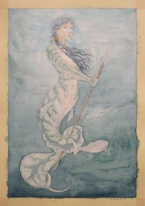
The original sketch is on the left. I redrew her on 140# Arches hot-press paper.
Perhaps this would be good time to mention that I’ve never painted an underwater scene before. I didn’t even have a clue how to start. Luckily someone posted a Photoshop tutorial on Deviant Art on just this subject. In about a half an hour I had a reasonable underwater background and much better chance of pulling this thing off.

The first wash.
At this point I mixed A LOT of paint. The basic green I used was Terra Verte from Dan Smith Inc. I have some issues with this pigment, but I won’t get into them now. It will be a suitable subject for it’s own post. I also mixed up some very old Windsor Newton Prussian Green, a separate puddle of Indigo (WN) and Terra Verte, and for the top, the ‘under-surface’ of the water, Cerulean Blue (WN) and Permanent Green Light (DS). I wet the paper as evenly as possible and finally started slapping down color. I had, however, forgotten that Cerulean has a tendency to not play well with others and it ‘precipitated’, separating from the green. Actually, it didn’t just separate, it dove into the paper and latched on. Momentary panic set in, followed by vigorous scrubbing, and a bit of swearing. You can still see the where the blue stained the paper in front of her face. The rest of the background went in comparatively easily. I set it aside to dry, and started breathing again.

The first layers of skin get painted.
When I was in art school sometime back in the Jurassic, my watercolor instructor wouldn’t let us use black. We had to mix it. She also gave us a great formula for Caucasian skin tone: Cerulean and Orange. Since she made us mix our blacks, she made us mix our oranges as well. (I don’t think I’ve ever owned a tube of Orange watercolor.) This time I used the aforementioned Cerulean along with Cadmium Red (WN) and New Gamboge (WN). Unfortunately, at this point in my process, I have several pools of paint mixed up and I start getting sloppy. I just dip my brush here and there, add a bit of water or a bit more pigment, keep things moving. As a result, I have no idea exactly what colors were used in the green and blue parts of her skin, the fishy bits. I started with the green, painting over the areas for both green and blue. In the picture below you can see the blue has been added.
She gets her hair done and I deepen the skin tones.
The first layer for her hair is straight Indigo. I think I went back in to the flesh tone a little bit here.

The fish get some definition and she gets some outlines.
I gave the school of fish behind her a bit of definition and then went in with colored pencil. I used black on her hair and then started on her edges with the black as well, but it was too flat. I grabbed my trusty Terra Cotta colored pencil, but that was too warm. So I covered the Terra Cotta with the black and successfully avoided a horrible Goldilocks metaphor. It looks as though I added another layer to the background here as well.

The first ‘finished’ version.
It was a good days work. I took her into the house to my resident color expert.
“That’s a good start,” she said.
“Start?”
“You never use enough contrast,” she said.
Sigh.
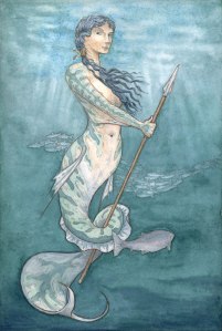
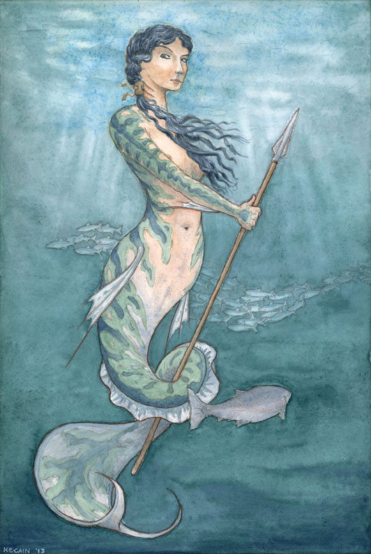
The next day was spent carefully adding layers, deepening shadows, refining linework. I showed her to Brenda that night, and while we all like the art, it still wasn’t ‘there’. The big difference you see here is the result of this being a scan and the others from our Canon point & shoot.

The ‘final’ final.
This is where my resident color expert (aka my wife) gets her real due. I knew the piece needed ‘more’. I just lacked the confidence to be as drastic as I needed to be. I’m fussing and fuming over how to proceed and she just points to a glob of paint on my palette.
“What’s that green?” she asks.
“Permanent Green Light. It’s too bright. I can’t use that.”
“Just mix it with this other stuff. It’ll be fine,” she says.
I do the tiniest bit, knowing it’s hopeless. It isn’t. It’s gorgeous. I don’t care if it makes me a wuss. I take my wife’s advice because she knows what the hell she’s talking about. The Permanent Green is very yellow, so it contrasts with all the blue green in the picture, popping the mermaid off the page. With the green in her fishy bits plumped up I move on to the blue and have a bit of fun. I used Lapis Lazuli (DS). It’s the real stuff, not synthetic. The batch I have is a greyish blue and it gives a lovely depth to her blue as well as a slight contrast to the blues around her. Her pink skin needed more warmth too. I didn’t want to use my skin tone mix, that would push her more to the brown side. So I used a thin layer of Garnet (DS), also the real stuff. Her hair got a little more black (mixed, of course), and a few more touches here and there, but after a day of sketching, a day of drawing, and three days of painting, I think she’s done. That may not keep me from fussing with her until she gets sent to the printers, but all in all, I’m pretty pleased with the outcome.
And don’t forget what this was for. Check out Brenda’s Kickstarter campaign. Donate if you can. Thanks.
 My original concept had the bees in a more abstracted form. But when the colors in the spiral started doing cool things, I knew the bees had to be more realistic, thereby adding depth. They are not completely realistic, they still fit within the confines of a circle, but there was a lot of – draw a few lines – look at a photograph – draw a few lines – look at a photograph. The painting process wasn’t much faster.