Inktober and Restrictions

Last year I tried doing Inktober, that online art challenge where you create an ink drawing every day in the month of October. I got about three days into it before something else claimed my time and I didn’t want to spend the time catching up. This year is different, in part, because I have a clearer focus than last time. Things (like paid work and deadlines) still claim my time and with less than half the month left to go, I’m still behind schedule. But this new focus keeps bringing me back.
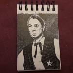
What is so different from last year? First off, I now follow Jake Parker, the originator of Inktober, on Instagram and I got the official prompt list well in advance. If I had been a diligent monkey, I would have started conceptualizing back in September, but I didn’t. Secondly, I decided to go into the challenge with a goal in mind — improve my skills in drawing faces and hands.


My scattershot approach to subject matter is obvious in the first five days. But the portrait of Eric Idle as Sir Robin (day 5 – chicken) set me off in a new direction. Still focusing on faces, but not so much on hands, I realized that movies were a great source of reference material. I can work with the title, like Whale Rider (day 12 – whale), a scene, like from Tom Jones (day 6 – drooling), a character, like Bella Swan (upcoming day 15 – weak), an actor, like Andy Sirkis (day 9 – precious), etc.


Even though I have placed another restriction (movies) on top of my first (faces) which I added to the existing restrictions of the prompt list and working in ink, it is actually easier for me to come up with ideas. This is seeing restrictions as a container, like a mold, within which you create something. It’s not my concept and I don’t remember where I originally learned it, but I think it’s valuable. Some may balk at the word ‘restriction’ thinking it has negative connotations. If so, then think of setting strong parameters or guidelines instead. You should end up in the same place.
Above all, keep making art.

World Calligraphy Day!

I was gone over the weekend and came home to an e-mail from John Neal Bookseller, a calligraphers Mecca in New York, that the 16th of August is World Calligraphy Day. More than one project involving calligraphy is perking in the back of my skull, so I thought I would do a little bit of practice and show some older pieces as well.

This is the Song of Amergin, an ancient Irish poem with many wildly varying translations. In the two pictures above, I’ve used my interpretation of an Anglo-Saxon hand using the Anlgo-Saxon runes thorn and wunjo. Several of the other letter-forms are also archaic, like the long ‘s’, d, f, g, k, t, and the ‘u’ used for both ‘u’ and ‘v’.

I wrote the poem out again using more modern letter-forms, but I goofed in line six. You can see the word ‘the’ beginning with thorn. Some habits are hard to break.

I did these without guidelines as an exercise; an attempt to get my hand to remember how to write these shapes. The images below are some old pieces I did when I played in the SCA. I think my hand was steadier back then.

AngPelInk1_SmMuriel AoA_SMPromissory w-Seal_SMFMN painted_Sm

End of the Digression

GriffinPrintRunEtsy

Well, they are printed, signed, numbered, and listed on my Etsy shop. These Norse Griffins were an experiment and time will tell how successful an experiment it was. My original thought was to have them for sale at the Oddmall show, but I completely ignored the logistics of how to sell unfinished art. Any promotional effort I made was too little, too late. And my hope of generating interest in my other linocut prints with my demo, never materialized.

PrintingGriffinEtsy

This is not to say that the endeavor was a failure. I learned a lot, and it may yet prove to be profitable. I’m certainly not sorry I took the leap.

For the geeking out aspect, I’m including a series of images showing the progression of the reduction printing process. I always find it challenging in a good way.  Multi-color printing without a safety net.

Griffin 1stColor

The first color. I carved away everything I wanted to stay white.

Griffin 2ndColor

The second color. Here I carved away everything I wanted to show as red.

Griffin 2ndColorCombo

And this is what the second color looks like printed on top of the first. The color balance is a bit off in this picture, but the orange toned down to a pumpkin like color.

Griffin 3rdColor

The third color, a blue-black mix attempting to match indigo. This outline is all that is left of the original block.

Griffin Final

And lastly, the third color printed on top of the others.

Little Guy and Griffin

This is the last entry before my printshop-in-a-show experiment. I’m nervous and excited. I think as long as I don’t leave something critical at home, it should be a lot of fun.

Dude7

The final color carved, inked, and ready to go.

I printed the third color on my little test subject. It’s a mixed blue trying to get close to indigo. When I pulled the first clean proof I could not help but smile. There is something entrancing about seeing this image appear for the first time.

Dude8

My little dudes lined up. The background isn’t quite as pink as it appears here.

Yes, I drew it and it’s nearly symmetrical, but you never really know what the final image will look like. That, at least for me, is one of the attractions of printmaking.

Griffin Carved

The first step, carving away what will be white.

I have much still to do today; print the first color on the griffin, get more supplies, print new signage, pack things up. But I can’t wait until that moment on Sunday when I pull the first finished griffin.

A Tangent Off the Digression

If you read my previous post you will know that I have temporarily veered away from my all-consuming zodiac project to prep for a show this coming weekend. I will be printing a linoleum block reduction print on site at Oddmall Tacoma. One of the features of a reduction print is the overlay of colors. Unlike multiple block prints where each color has its own block, reduction prints use only one block which is carved away as the printing process progresses. This means you only get one shot at it. So instead of risking a major public face-plant, I decided to test my color ideas.

I could have just cut some simple geometric shapes and run some color tests, but where’s the fun in that? The paper for the Griffin piece is 8×10 and after cutting down the parent sheets, I was left with thirty 4×6’s. I got a 2×3 block when I went to buy more ink and started drawing.

Dude1

The image drawn directly onto the block in pencil and then refined in pen.

The image is derived from an ornament on a horse collar from an archeological find in Søllested, Denmark. The Griffin is also inspired by beasts on the horse collars in the same find.

Dude2

The areas I want to stay white have been carved out. I lowered the angle of my desk light to hopefully show the carving.

My previous multi-color Norse block prints have had a Naples yellow-like background and I wanted to do something different that would still feel like it was part of the same series. On the mixing glass and on the block, the ink looks way too pink, but the print came out close enough to what I wanted.

Dude3

The mixed ink and the ink on the block.

Dude4

First impression drying inside the studio.

The second color is lighter than the first and I had no idea how well it would cover. The mix is yellow ochre-ish, but because it’s on top of the rose color it changes to a gold or Raw Sienna.

Dude5

The yellow ink on the block and the print ready for the second impression.

Dude6

After the second impression.

Next up will be the outline in a dark blue and carving the Griffin.


The Digression

I’m going to take a slight break from the Zodiac project this week to prepare for a show I’m doing next weekend. Originally it was not on my schedule, but the date opened up and spaces were still available.

The show, Oddmall, has been in Everett,WA for a few years and I’ve done it since 2014, both in fall and summer. Now the organizer is expanding his reach down to Tacoma and I decided to give the new venue a try. I was able to obtain a second booth space at a discount and wondered “What could I do with the extra space?” My inventory comfortably fills a 6×8 booth so twice the space with the same stock would look sparse. But I’ve been listening to a podcast on art marketing, selling, working conventions, etc. and following their advice, I saw a possibility.

I could set up a print shop.

Norns_PrintRun_Close_72

A print run from a couple years ago in my studio.

I don’t have a press any more, but all the printing I’ve been doing lately has been by hand, using a barren. The ink I use is water-soluble, so no stinky solvents. The promoter thought it was a great idea and we got the go-ahead from the venue. So here I go!

GriffinSketch1SM

The original sketch, about 5×7.

Since my shop name is the Literate Griffin, I decided to do a Norse inspired griffin, done as a reduction print in a very limited run, and available only at the show.

GriffinTransfer

I placed the original sketch face down on a linoleum block and used the side of a medium-soft pencil to to transfer the image.

I’ll post updates and shots from the event. Or better yet, come see me there!

Virgo Detail

I’m going to try to keep these posts coming more frequently. So they may not have very zippy titles. I’m also posting on Instagram (kecain59), my website blog (kevinecain.com), and on Facebook, hopefully every weekday.

This is a detail of the border for mutable Earth on the Virgo piece. Normally Celtic spirals are painted in three different colors, but since these borders​ are related to the elements, I’m keeping them monochromatic. For Earth I’m using Oxide of Chromium, Serpentine Genuine, and a mix of Sap, Oxide, and probably something​ else. My palette gets a little chaotic.VirgoBorderDetail

The Zodiac 2

Not all of our original concepts turn out to be practical. A case in point was my idea to paint each Zodiac sign as they progressed through a lunar month. (Aries with the moon in Aries, Taurus with the moon in Taurus, etc.) I got a late start on Aries, beginning it on the day the moon passed out of that sign, so I got it inked, but not painted. Then I only had one practical working day for Taurus and had to jump into Gemini the day after that due to other scheduling. Perhaps if I had consulted my calendar prior to diving in head first. Ah well. With a little retro-scheduling I think I have a timeline that works.

AriesFirstColor_Sm

Aries first color: Naples Yellow and Garnet Genuine over a pale wash of Buff Titanium.

The result has been to take a more realistic approach to the project. I am attempting to ink the artwork while the moon is in the sign and the painting will be an ongoing process that has to fit around my other work. The goal is to have all twelve pieces finished in time for a show in May.

Taurus_Gemini_Close_Sm

Taurus and Gemini. The calligraphy is done with a straight cut Brause nib and Calli ink. The line work with a Micron 005 marker.

A hopeful time-saver is laying out four images on a single sheet of Arches 140 lb hot press. Since I’m starting with an overall thin wash of Buff Titanium, I can do four images at once. The framework the roundel sits in will also be consistent in color. Even if this does not make the work go faster, it will make it more efficient.
Cancer is on the schedule for today. So off to work.


The Self-Imposed Deadline

Ideas simmer on the back burner like a pot of marinara. Concepts cook down to their essence. Images meld and mingle into new flavors. This all sounds better than “I haven’t gotten around to that project yet.” But it actually can be what happens if you let it.
I have an idea for a Large Project that fits in to my Celtic artwork and my esoteric interests rather nicely. It will eventually involve many pieces of art and I have been thinking of how to make it more manageable. One day this winter, as I was sitting in my big, comfy chair, all wrapped up and fighting off a fever, my mind got bored and started to wander. There are Celtic versions of the signs of the Zodiac that I knew would have to be part of the Large Project, but they had sat, simmering on the back burner for the last 5-6 years. And suddenly, in my bundled-up, fevered state, I saw what they were supposed to look like.
zodiaccomps
Once I knocked my fever down I went straight to the drawing board and cranked out these designs. It took me about three days. A bit more thinking, playing around with color, and gathering of opinions occurred. I needed to fit the work in between other jobs, so it sat for a while even though I knew I was starting to run up against the clock (I want these printed before a show in May).
There was then a sudden realization that I should paint each one of these while the moon is in the appropriate sign. I asked my wife where the moon was today and she told me it was in Aries until early evening. Aries, the first sign of the Zodiac. If there was a more auspicious place to start, I wasn’t going to wait for it.
I had already laid out the basic design on watercolor paper, so I did the calligraphy, traced the design elements unique to Aries, and inked it in. I didn’t get to the painting because I ran out of time before having to dash off to a meeting. But it’s underway.
ariesinkphotoweb
The moon is moving into Taurus shortly after I write this, and it will only be there for two days. This pot is no longer simmering.

Bee Spiral – the Finish

The good news is that the piece survived being wrapped around an 11” diameter drum scanner. The gold looks no worse for wear and I am almost breathing again. The less than good news is that gold leaf doesn’t scan worth a damn. I’m not laying this on the fabulous folks who did the scan, they did the best they could, and if it wasn’t for the gold, the scan would be perfect. This is going to lead me on my next big adventure in art prints; how do you reproduce gold in an archival print?

Meanwhile, back at the drawing board…

BSpiralBeeDetail1webMy original concept had the bees in a more abstracted form. But when the colors in the spiral started doing cool things, I knew the bees had to be more realistic, thereby adding depth. They are not completely realistic, they still fit within the confines of a circle, but there was a lot of – draw a few lines – look at a photograph – draw a few lines – look at a photograph. The painting process wasn’t much faster.

The bees are mostly done (I went back later and punched up the black) and I'm laying down the first layer of black, which isn't really black.

The bees are mostly done (I went back later and punched up the black) and I’m laying down the first layer of black, which isn’t really black.

With the bees finished, I moved on to the ‘black’. I write it that way because it isn’t black. In fact there isn’t any black on this piece at all. What you see here is a mix of Burnt Umber and Ultramarine. If any of you have studied classical painting, you will have heard of this mixture. I had not until recently. My usual mix for black is Alizarin Crimson, Prussian Green, and Indigo. I think these pigments have seen changes that offer better lightfastness and lower toxicity, and I think there has been a color shift as well. My old black mix doesn’t respond the way it used to. It’s a subtle thing that most people would not notice. I do. So I went to the Ultramarine/Burnt Umber mix and got very nice results. There was a slight panic when I realized I had no Burnt Umber paint. Luckily I remembered my natural pigments and ground up a small batch. It blended beautifully with the Ultramarine. The snippet you see above is just the first layer. I went back with two or three more layers to get the density I wanted without that flat wash look.

The final. Whew!

The final. Whew!

I am very pleased with the finished piece. I’ve been calling it the bee spiral, but the real name is ‘The Waggle Dance’, and the gold pattern in the corners is derived from the motions the bees go through. Honey bees use this ‘dance’, and others, to communicate the location of a nectar source when they return to the hive. It is thought that some insecticides may inhibit the bee’s ability to waggle dance, thus making it harder to find food, which in turn, could be a contributor to colony collapse disorder. For this reason, I’m going to dedicate at least 10% of sales to research and preservation for honey bees.