It’s been ages since the last post. A show, an Etsy shop, two workshops, and an operating-system-upgrade ago, not to mention all of the seasonal celebrations, initiations, and continued learning. Oh, and let’s not forget about editing a YA manuscript. The dreary bit is that I look back at it all and wonder, “Where is the art?”. Sigh.
I am learning to accept that the conceptual stage of art making is still considered progress. And there are several projects that are in the concept/planning stage, one of which is the opportunity to be part of a group show, participating with folks from a workshop I took in February. More on that as it progresses.
Coming up soon (as in terrifyingly soon) is the summer version of a show I did last November – OddMall: Emporium of the Weird. It is a fabulous collection of art and craft ranging from fairies to steampunk to esoterica. I had a wonderful time and sold enough to make me want to come back. I wanted to have a nice selection of new stuff, but as you can see from the abbreviated list of activities above, I’ve been a little busy with other things. So in the tried and true method of last-minute, panic-inspired art making, here’s what I’m up to at the moment.
I wanted to add to my Celtic-Medieval Pop Art series and realized I had a great candidate in the Minecraft Creeper. I also wanted to make the art more like a manuscript page rather than just a vignette.
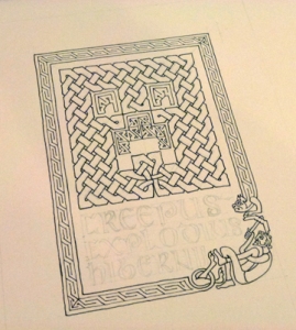
Creepus Explodius Hibernii with Steve cowering in the corner and an ocelot border. Haven’t done the lettering because my calligraphy ink turned truly icky.
People have already made pseudo-scientific art of the Creeper and of course given it a proper genus and species – creepus explodius. These being Latinesque, I had to keep them, adding the sub-species name ‘hibernii’, meaning an Irish Creeper. Of course, the system of taxonomy didn’t exist in medieval times, but who cares.
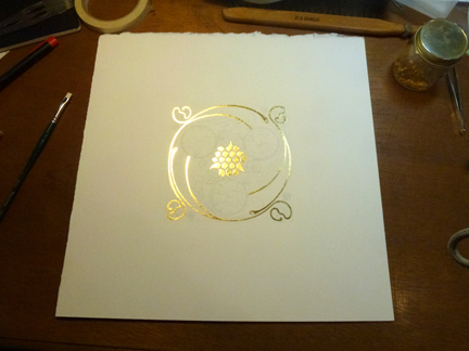
The other piece I’m currently working on is far more serious. It is a Celtic spiral design incorporating honey bees. As I work on it, I strive to remain focused on the blessings these amazing animals bestow on us. We need to do everything possible to ensure their survival, and to that end, I plan to donate a percentage of the sales of this piece to an organization dedicated to preserving bees and other pollinators. When I get that nailed down, I’ll let you know.
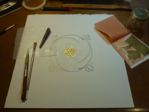
Bee Spiral with the first bit of gold in the center. You can see the glue where the rest of the gold will go.
I started the design work perhaps a year ago. Then this spring I decided to go for it and ran into all sorts of problems laying down gold leaf. I trust that I have worked through the issues and I’m taking another stab at it. It will be a stretch, but my goal is to have prints available at OddMall. After that they will be up on my Etsy site, and of course you can always find my work on my website.